Nuvei Fields
Description
The Nuvei Fields module is designed to securely collect and process card payment data within a checkout. It provides a customizable interface for entering card details, validating input, and initiating payments.
This module consists of two main parts:
NuveiFieldscomponent – a UI component that renders input fields for cardholder name, card number, expiration date, and CVV. It supports dynamic styling, validations, and localization viai18NLabels. It also manages user interactions, card type detection, and triggers payment initialization.useNuveiFieldshook – a logic layer that handles fields data, input formatting, validation, tokenization, and 3D Secure (3DS) authentication.
InputComponent
Overview
Purpose - InputComponent is a reusable component that combines a label, a text input field, and an optional error message into a single layout.
It is designed to standardize form input behavior and styling across an application.
Where it is used - InputComponent can be used anywhere a labeled text input is required.
What the component does
At a level, this component displays a label above a text input field, renders a customizable text input using the TextInput component, optionally shows an error message below the input, and supports custom container/label/input/error styling along with standard TextInput props.
-
Label Rendering
- Displays a text label above the input field.
- Uses default styling defined in the component but allows customization through the
labelStyleprop.
-
Input Field
- Renders a
TextInputcomponent with predefined border, padding, and radius styles. - Allows full customization through the
inputStyleprop or by passing standardTextInputprops.
- Renders a
-
Error Handling
- Optionally displays an error message below the input field.
- The text color and font size can be customized via
errorStyle.
-
Layout and Styling
- The component arranges the label, input, and error vertically.
- Extra layout customization can be applied using the
extraStylesprop.
Data structure
Request
type LabelAndErrorContainerPropsType = PropsWithChildren<{
  label: string | undefined;
  extraStyles?: object;
  errorText?: string;
  labelStyle?: TextStyle;
  errorStyle?: TextStyle;
}>;
| Name | Type | Description |
|---|---|---|
| label | string | Text displayed above the input. |
| extraStyles | object | Additional styles for the container |
| errorText | string | Text displayed below the input when an error occurs. |
| labelStyle | TextStyle | Custom style for the label text. |
| errorStyle | TextStyle | Custom style for the error message. |
Key components
LabelAndErrorContainer(props)
- A functional component that wraps an input field together with its label and error message.
- Displays the label text above the input.
- Renders any child components (usually a
TextInput). - Shows an optional error message below the input.
- Applies default styles for label and error, allowing custom overrides via props.
InputComponent(props)
- A wrapper component that integrates
LabelAndErrorContainerwith aTextInput, providing a labeled input with error handling. - Combines label, text input, and error message into one component.
- Passes all
TextInputprops (value,onChangeText,keyboardType,secureTextEntry) to the internalTextInput. - Supports style customization for each section (label, input, error, container).
- Allows error message display without managing layout manually.
Integration
import { InputComponent } from './InputComponent';
<InputComponent
	{...getInputProps({
	  fieldName: '...',
	  labelFieldName: '...',
	  placeholderFieldName: '...',
	})}
  />
Error handling
Validation Errors - The component does not perform validation itself but can display validation messages passed via the errorText prop.
NuveiFields
Overview
Purpose - NuveiFields renders a set of input fields (InputComponent) for processing card payments. It collects user card data (cardholder name, card number, expiration date, CVV), validates it, and handles tokenization and payment initialization.
Where it is used - This component is used on checkout or payment screens where card payments are accepted.
What the component does
-
Initial Setup
- Accepts props for
transactionDetails,paymentSettings,uiSettings, payment result callbacks, and optional form-event callbacks. - Initializes all card-related states and logic through
useNuveiFields.
- Accepts props for
-
UI Rendering
- Dynamically builds customized styles based on
uiSettings(border, color, font). - Renders four input fields (Cardholder Name, Card Number, Expiration Date, CVV).
- Card Number input includes dynamic brand logo detection.
- Each field supports localized labels and placeholders via
uiSettings.i18NLabels.
- Dynamically builds customized styles based on
-
Validation and Tokenization
- Card validation is managed by the validation hooks and states.
- Payment initialization is NOT managed directly by the
NuveiFieldscomponent. Instead, the parent component must import theuseNuveiFieldsPayhook, which returns apayHandlerfunction that triggers validation, error check, payment initialization, and loading overlay state (ModalBackdrop).
-
Success and Error Handling
- The
onSuccess(response)andonFail(error)callbacks provided as props to the component are invoked automatically when the payment hook completes successfully or fails. - The loading overlay (
ModalBackdrop) inside the component is shown/hidden automatically during the payment operation.
- The
-
Dynamic Card Detection
- Automatically detects card type (
Visa,MasterCard,Maestro) viacheckCardType(). - Displays the appropriate card logo next to the card number input.
- Automatically detects card type (
-
Ref Exposure (Imperative Handle)
- Exposes
validateFields()andtokenize()methods to the parent component via a ref, allowing imperative validation and tokenization from outside the component.
- Exposes
Data structure
Props
The NuveiFields component accepts the following props:
type Props = {
  paymentSettings?: Partial<PaymentSettings>;
  transactionDetails: TransactionDetails;
  uiSettings: UiSettings;
  onSuccess: (response: any) => void;
  onFail: (response: any) => void;
  forceWebChallenge: boolean;
  callbacks?: {
    onPaymentFormChange?: (payload: OnPaymentFormChangePayload) => void;
    onFormValidated?: (payload: OnFormValidatedPayload) => void;
    onInputUpdated?: (
      hasFocus: boolean,
      expMonth: string,
      expYear: string
    ) => void;
    onInputValidated?: (errors: string[]) => void;
  };
};
| Prop | Type | Required | Description |
|---|---|---|---|
transactionDetails | TransactionDetails | Yes | Details of the transaction including session token, merchant identifiers, amount, billing details, etc. |
uiSettings | UiSettings | Yes | Object defining font sizes, colors, borders, custom i18N labels, and card lookup management. |
paymentSettings | Partial<PaymentSettings> | No | Optional client settings including Google Pay details or target backend settings. |
onSuccess | (response: any) => void | Yes | Callback invoked when the payment transaction completes successfully. |
onFail | (response: any) => void | Yes | Callback invoked when validation, network request, tokenization, or payment fails. |
forceWebChallenge | boolean | Yes | If set to true, enforces the web challenge for 3DS authentication. |
callbacks | { onPaymentFormChange?, onFormValidated?, onInputUpdated?, onInputValidated? } | No | Event callbacks for field interaction and form validation. |
When NuveiFields mounts or the callback props change, it registers the supplied functions in NuveiFieldsContext through setOnPaymentFormChange and setOnFormValidated. The input and validation code reads the callbacks from this shared context, so the events are emitted by the field components rather than directly by the parent screen.
onPaymentFormChange
Called when a payment form field gains or loses focus. Card-number values are masked in the event payload.
type OnPaymentFormChangePayload = {
  pm: string;
  label: string;
  action: 'focus' | 'blur';
  oldValue: string;
  newValue: string;
  validation: string | null;
  paste: boolean;
};
| Field | Description |
|---|---|
pm | Payment method name. For Nuvei Fields this is cc_card. |
label | Localized label of the field, such as Card number or CVV. |
action | Whether the field received focus or lost focus. |
oldValue | Value captured before the event. Sensitive card-number data is masked. |
newValue | Current value after the event. Sensitive card-number data is masked. |
validation | Current validation message, or null when the field is valid. |
paste | true when the value associated with a blur event was pasted. |
How it works internally:
- Each
InputComponentkeeps its previously reported value inlastValueRefand tracks whether the latest edit appears to be a paste. - On focus or blur, it calls
validateFields(true). Thetrueargument performs silent validation: errors are recalculated, butonInputValidatedis not fired and thevalidateTriggereddisplay flag is not toggled. - For the card-number field, a custom blocked-card error takes precedence over the normal number validation error.
- The component builds the payload using the localized label, the previous and current values, and the current validation result. Card-number values pass through
maskPaymentFormChangeValuebefore leaving the SDK. - The callback runs only for
focusandblur; ordinary keystrokes do not emit the event. A change of more than one character at once is treated as a paste, reported on blur, and then reset. - After emitting,
lastValueRefis updated so the next event'soldValuereflects the last reported value.
onFormValidated
Called when the overall form validity or set of invalid fields changes.
type OnFormValidatedPayload = {
  isFormValid: boolean;
  invalidFields: string[];
};
For Nuvei Fields, invalidFields can contain ccNameOnCard, ccCardNumber, ccExpYear, and ccCVV. A blocked card can also add creditCardBlocked.
How it works internally:
NuveiFieldswatches the card state and the custom card-number error. Whenever either changes, it runsvalidateFields(true)to calculate the current form state without displaying new errors.- It collects every field whose validation result is non-empty and maps the internal keys to the public names:
cardHolderName→ccNameOnCardnumber→ccCardNumberexpiry→ccExpYearcvv→ccCVV
isFormValidistrueonly when the mappedinvalidFieldsarray is empty.- A ref stores the previously emitted validity and comma-joined invalid-field list. The callback runs only if one of those values changed, preventing repeated identical events on re-render.
- Because validation is silent, this event does not toggle the error-display trigger, fire
onInputValidated, or start a payment.
<NuveiFields
  {...props}
  callbacks={{
    onPaymentFormChange: (payload) => {
      console.log('Field event:', payload);
    },
    onFormValidated: ({ isFormValid, invalidFields }) => {
      console.log('Form valid:', isFormValid, invalidFields);
    },
  }}
/>
TransactionDetails
This represents the transaction configurations (without the sensitive card details):
type TransactionDetails = {
  sessionToken: string;
  merchantId: string;
  merchantSiteId: string;
  clientRequestId?: string;
  amount?: string;
  currency?: string;
  billingAddress?: BillingAddress;
  shippingAddress?: ShippingAddress;
  userDetails?: UserDetails;
  requestTimeout?: number;
  timeout?: number;
};
UiSettings
Defines visual formatting, internationalization labels, and card validation settings:
type UiSettings = {
  customFonts: boolean;
  backgroundColor: ColorType;
  borderColor: ColorType;
  borderWidth: number;
  cornerRadius: number;
  labelFontSize: number;
  labelFontColor: ColorType;
  fieldFontSize: number;
  fieldFontColor: ColorType;
  fieldBackgroundColor: ColorType;
  placeholderFontColor: ColorType;
  fieldBorderColor: ColorType;
  fieldBorderWidth: number;
  fieldCornerRadius: number;
  errorFontSize: number;
  errorFontColor: ColorType;
  i18NTextManagement: boolean;
  i18NLabels: i18NFieldsType;
  getCardDetailsManagement: boolean;
  cardBrand: string;
  cardBrandError: string;
  requestError: string;
};
Key functions and variables
useNuveiFieldsPay
- Hook that returns a handler function (
payHandler) to validate the input fields and trigger the payment process.
validateFields
- Checks all input fields for correctness and returns
{ hasErrors: boolean, newErrors: errorsType, errorsArr: string[] }.
tokenize
- Generates a card token.
checkCardType
- Detects card type based on entered card number.
getCreditCardLogo
- Returns brand logo image for detected card type.
Integration
Import the component and the payment hook:
import { NuveiFields, useNuveiFieldsPay } from 'react-native-nuvei';
Example usage in a payment screen component:
import React from 'react';
import { View, Button } from 'react-native';
import { NuveiFields, useNuveiFieldsPay } from 'react-native-nuvei';

export function PaymentScreen() {
  const payHandler = useNuveiFieldsPay();

  return (
    <View>
      <NuveiFields
        transactionDetails={transactionDetails}
        uiSettings={uiSettings}
        paymentSettings={paymentSettings}
        onSuccess={(res) => console.log('Success:', res)}
        onFail={(err) => console.log('Fail:', err)}
        forceWebChallenge={false}
      />
      <Button title="Pay" onPress={payHandler} />
    </View>
  );
}
Requirements
transactionDetailsmust be a validTransactionDetailsobject (with amount, currency, merchant details).uiSettingsshould contain all visual customization values (colors, borders, fonts).- A valid
PaymentSettingsobject is required.
Error handling
Validation errors
- If any input field is empty or invalid,
validateFields()returns an error message that appears below the field.
Network or SDK errors
- Errors thrown during
tokenizeorinitPaymenttriggeronFail(error)
Payment declined
- If the backend returns a declined transaction, the component calls
onFailwith the declined response.
UI behavior
- The loader (
ModalBackdrop) is displayed until the operation completes.
Diagram and description
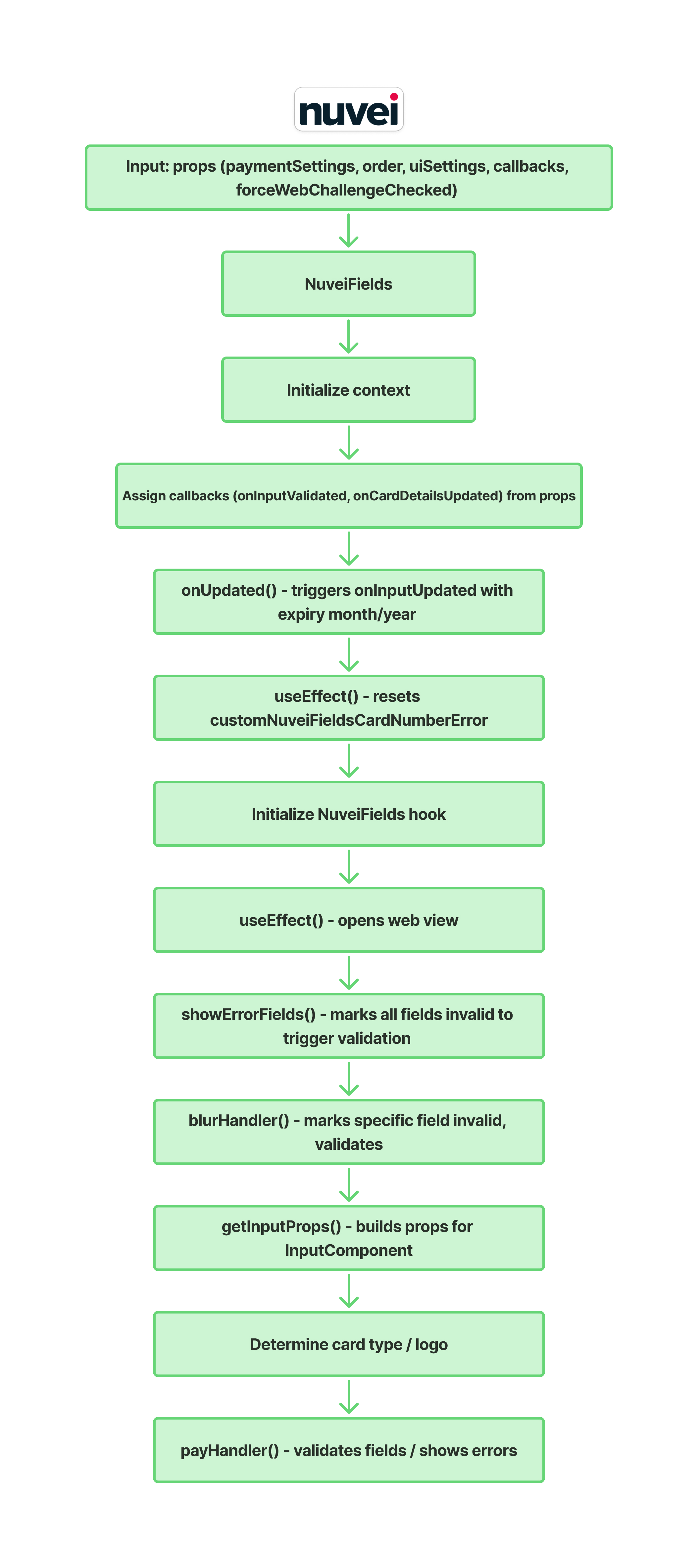
Component: NuveiFields
Context and State
- Uses useNuveiContext for card number error handling. States:
- showEmptyFieldError, validateTriggered, showErrorByField → validation flags.
- isLoading → payment in progress.
- webViewParamsProps, webviewOpen → 3D Secure challenge state.
Callback
- If props.onInputValidated exists → assigns the value to a local onInputValidated.
Input Update Logic
- onUpdated: Splits expiry into month/year and calls onInputUpdated.
Effects
- Clear effect: resets custom card number error to
"". - Effect → opens webview when webViewParamsProps is set.
NuveiFields Hook
- card: Current card state.
- handleInputChange: Updates card fields.
- errors: Validation errors.
- validateFields: Runs validation.
- tokenize: Tokenizes card details.
- initPayment: Initiates payment.
- loadingCardDetails: Loading state for card details.
Validation
- showErrorFields: Marks all fields invalid, triggers validation.
- blurHandler: Marks specific field invalid, validates, resets empty field error, calls onUpdated(false) if value exists.
Card Type and Logo
- Uses checkCardType(card.number) to determine card type.
- Displays appropriate logo (Maestro icon or dynamic logo).
Payment Handler (via useNuveiFieldsPay)
- Invoking
payHandler(fromuseNuveiFieldsPay) will:- Validate form fields.
- Display field-specific validation errors.
- If no errors, sets loading state and starts payment initialization.
- Automatically handles successes (
onSuccess) and failures (onFail).
Render
- KeyboardAvoidingView → ensures proper keyboard handling.
- ScrollView → wraps inputs.
- InputComponent for cardHolderName.
- LabelAndErrorContainer + TextInput for card number (with logo).
- Two InputComponents side by side for expiry and cvv.
- WebView3D → handles 3D Secure challenge.
NuveiFields Logic
Overview
Purpose - useNuveiFields manages all the logic for card payment processing in the Nuvei SDK.
It handles user input state, validation, tokenization, and payment initialization.
Where it is used - It is used internally by the NuveiFields component.
What the module does
-
Context Integration
- Retrieves shared states (card data, validation errors, labels, loadingCardDetails flag) from
NuveiFieldsContext. - Accesses global card blocking settings (
blockCards) and custom card number error states fromNuveiContext.
- Retrieves shared states (card data, validation errors, labels, loadingCardDetails flag) from
-
Input Handling and Card Lookup
- Dynamically formats and normalizes inputs as they are typed:
- Card Number: grouped into 4-digit segments (
#### #### #### ####). - Expiry Date: formatted as
MM/YY. - CVV: restricted to numeric characters.
- Card Number: grouped into 4-digit segments (
- When a valid card format/type is detected on input:
- Triggers an asynchronous BIN lookup via
getCardDetails(). - Checks the card against configured block rules.
- Triggers an asynchronous BIN lookup via
- Calls
onUpdated(true)to notify the parent component of user activity.
- Dynamically formats and normalizes inputs as they are typed:
-
Validation
- Exposes
validateFields()(sourced fromuseValidateFields) which checks form completeness and formatting:- Card number format and brand detection.
- Expiry date validity.
- CVV length based on card type.
- Cardholder name completeness.
- Triggers the
onInputValidatedcallback with an array of active error codes. - Returns
{ hasErrors: boolean, newErrors: errorsType }.
- Exposes
-
Tokenization
- Exposes the
tokenize()function (sourced fromuseTokenize) which sends card details securely to the Nuvei API usingtokenizePost(sessionToken, card)and returns the tokenization response.
- Exposes the
-
Payment Initialization
- Exposes
initPayment()which constructs aCardInfopayload and triggers 3D Secure verification viauseAuth3D(). - Returns a
Promisethat resolves on success or rejects on failure.
- Exposes
Data structure
Arguments
The useNuveiFields hook accepts the following parameters:
| Parameter | Type | Description |
|---|---|---|
transactionDetails | TransactionDetails | Details of the transaction (merchant settings, sessionToken). |
paymentSettings | Partial<PaymentSettings> | Optional billing/shipping or payment method configurations. |
setWebViewParamsProps | Dispatch<SetStateAction<WebViewParams | null>> | State setter function to handle WebView coordinates/parameters for 3D Secure challenge. |
onUpdated | (isFocus: boolean) => void | Callback triggered when field updates or blur event executes. |
setShowErrorByField | Dispatch<SetStateAction<{[key: string]: boolean}>> | State setter to manage error visibility dynamically per field. |
forceWebChallenge | boolean | Flag indicating whether the 3D Secure challenge should be forced. |
Return Value
The hook returns the following object:
{
  handleInputChange: (field: CardFieldType, value: string) => void;
  initPayment: () => Promise<any>;
  card: CardType;
  errors: errorsType;
  setErrors: Dispatch<SetStateAction<errorsType>>;
  setCard: Dispatch<SetStateAction<CardType>>;
  setLabels: Dispatch<SetStateAction<UiSettings['i18NLabels']>>;
  validateFields: (silent?: boolean) => { hasErrors: boolean; newErrors: errorsType };
  tokenize: () => Promise<any>;
}
Key functions
handleInputChange(field, value)
- Updates card input state and handles formatting.
- Applies specific formatting/normalization:
number: groups into 4-digit segments and initiates asynchronous BIN details/block checks.expiry: formats asMM/YYformat.cvv: digits only.
- Resets validation error markers for the edited field.
validateFields(silent?: boolean)
- Validates expiration, cardholder name, CVV, and card number.
- Updates field error states.
- Returns
{ hasErrors: boolean, newErrors: errorsType }.
tokenize()
- Securely tokenizes the card details using
tokenizePost(sessionToken, card). - Resolves with the tokenized card details, or rejects if validation fails or a network error occurs.
initPayment()
- Builds the card details and initiates the 3D Secure verification flow via
auth3D(). - Resolves when payment completes successfully, or rejects with an error payload.
Integration
This hook is used internally by the NuveiFields component to bind inputs, manage states, perform validation, and handle card detail lookups:
import { useNuveiFields } from './NuveiFields.logic';
Error handling
Validation errors
- Detected in
validateFields(). - Errors are stored in the
errorsstate and displayed below input fields.
Network or SDK errors
- If
tokenizeorinitPaymentfails, the parent component callsonFail(error).
3D Secure authentication errors
- Returned by
auth3D()through theonErrorcallback.
Diagram and description
useNuveiFields
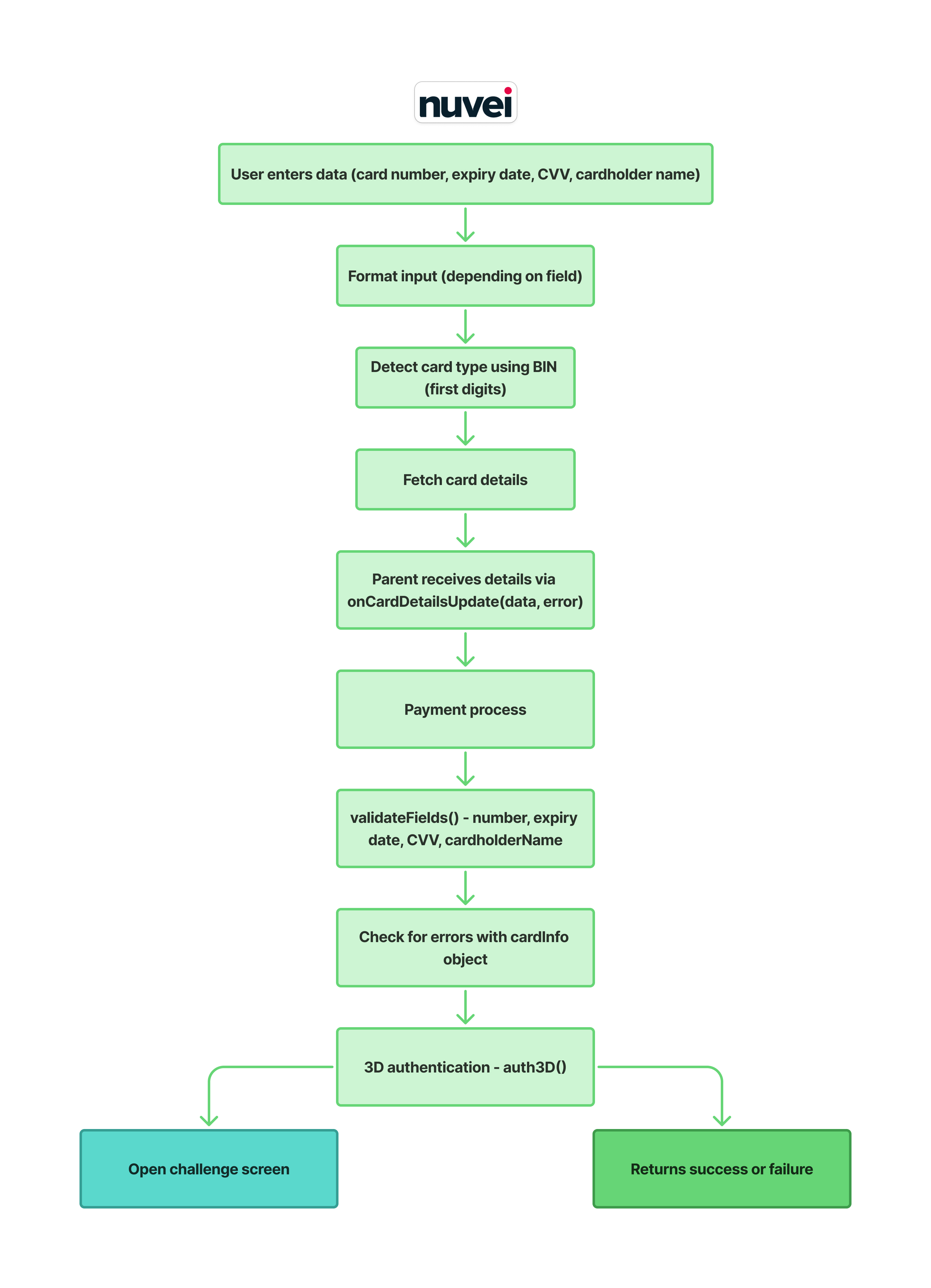
This hook manages all logic required for handling credit card input fields, validating them, formatting user input, fetching card details, and initializing a payment using 3DS authentication.
- Initialization
When the hook is executed, it retrieves shared state from
NuveiFieldsContext(viauseNuveiFieldsContext) instead of initialising its own state:
- Card, errors, labels, loadingCardDetails — all sourced from
NuveiFieldsContext. validateFields— obtained from theuseValidateFieldshook (defined inNuveiFieldsContext).tokenize— obtained from theuseTokenizehook (defined inNuveiFieldsContext).
Also retrieves:
setCustomNuveiFieldsCardNumberError,blockCardsfrom the global Nuvei context (useNuveiContext).- 3DS authentication handler (
auth3D) viauseAuth3D.
- Handling Input Changes (handleInputChange) Whenever the user types into any card field:
2.1 Trigger onUpdated - onUpdated(true)
-
Marks the field as focused or updated.
2.2 Clear previous validation
-
Removes the card number block error.
-
Clears UI error flags for the field.
2.3 Format and validate the field
-
Field Formatting
-
number: Groups digits into XXXX XXXX XXXX XXXX
-
expiry: Converts to MM/YY format
-
cvv: Removes all non-digits
-
cardHolderName: Text
After formatting, the hook updates state and validates using setCardPropAndValidate()
-
Getting Card Details Inside setCardPropAndValidate, after updating the card:
3.1 Detect card type
-
const parsedCard = getParsedCard(value);
3.2 If card type is valid it fetches card details
-
const res = await getCardDetails(body);
-
If successful: Uses the returned card details to evaluate the configured card-blocking rules.
- Validating Fields (validateFields) When the user attempts to proceed with payment:
4.1 Validate each field Number: card format + card type detection Expiry: MM/YY format, month range, date not expired CVV: correct length based on card type Name: non-empty + valid characters
4.2 Create error list
-
All failed validations are collected and passed to onInputValidated(errorCodes)
4.3 Update errors state
-
If any errors exist UI is updated
-
If there are no errors error state is cleared
- Tokenizing Card Data (tokenize)
-
Wrapper around: tokenizePost(transactionDetails.sessionToken, card)
-
Used when a token is needed.
- Initializing Payment (initPayment)
-
When ready to charge the card:
6.1 Prepare card info object
const cardInfo = {
  CVV,
  cardNumber,
  cardHolderName,
  expirationMonth,
  expirationYear
}
6.2 Trigger 3DS authentication
auth3D({...})
This handles:
- challenge screens
- frictionless flows
- success and error callbacks
useNuveiFieldsPay
Overview
Purpose - useNuveiFieldsPay is the hook that drives the "Pay" button action in the NuveiFields component.
It orchestrates field validation, 3D Secure payment initialization, loading state, and the final onSuccess / onFail callbacks — all sourced from NuveiFieldsContext.
Where it is used - Called once inside NuveiFields.tsx. Returns the payHandler function, which is bound directly to the Pay button's onPress.
What the hook does
At a high level, this hook runs validateFields() before attempting any payment network call. It guards against blocked card numbers (customNuveiFieldsCardNumberError) and in-progress card-detail fetches (loadingCardDetails), sets isLoading = true while the payment request is in flight and resets it when done, and invokes onSuccess from context on success or onFail on any error.
-
Reads from context
Consumes the following from
useNuveiFieldsContext():card— current card field values.paymentSettings,transactionDetails,forceWebChallenge— payment configuration.setIsLoading,setWebViewParamsProps— UI state setters.onSuccess,onFail— result callbacks registered by the parent component.loadingCardDetails— guard flag set whilegetCardDetailsis pending.
Also consumes:
customNuveiFieldsCardNumberErrorfromuseNuveiContext()— present when the card is blocked.validateFieldsfromuseValidateFields().auth3DfromuseAuth3D().
-
initPayment()(internal async function)- Builds a
CardInfoobject from the currentcardstate. - If
customNuveiFieldsCardNumberErroris set, immediately rejects with error code10010. - Otherwise calls
auth3D()to start the 3D Secure flow, passing:paymentSettings(withcardinjected intopaymentOption).forceWebChallengeChecked.navigateToWebview— setswebViewParamsPropsto open the 3DS WebView.onSuccessandonError(resolve / reject of the wrappingPromise).source: RequestSource.FIELDS.nvPaymentMerchantSettings: transactionDetails.
- Returns a
Promisethat resolves or rejects when the auth flow completes.
- Builds a
-
payHandler()(returned function)The main entry point bound to the Pay button:
const { hasErrors } = validateFields();
if (customNuveiFieldsCardNumberError || loadingCardDetails) return;
if (!hasErrors) {
  setIsLoading(true);
  try {
    const res = await initPayment();
    onSuccess(res);
  } catch (error) {
    onFail(error);
  } finally {
    setIsLoading(false);
  }
}- Runs validation first; if any field is invalid the Pay button does nothing (errors are shown on screen via
validateFields). - Aborts silently if the card is blocked or card details are still loading.
- On success calls
onSuccess(res)and resets the loader. - On failure calls
onFail(error)and resets the loader.
- Runs validation first; if any field is invalid the Pay button does nothing (errors are shown on screen via
Key functions
initPayment()
- Internal async function that builds the 3DS auth request and returns a
Promise. - Not exported — only consumed by
payHandler.
payHandler()
- The value returned by the hook.
- Async function bound to the Pay button.
- Guards, validates, calls
initPayment, and dispatches success / failure callbacks.
Integration
import { useNuveiFieldsPay } from './hooks/useNuveiFieldsPay';

const payHandler = useNuveiFieldsPay();
// ...
<Button onPress={payHandler} title="Pay" />
The hook must be called inside a component that is wrapped by NuveiFieldsProvider and NuveiProvider.
Error handling
Validation errors
- If
validateFields()returnshasErrors: true,payHandlerreturns early. Error messages are already set in theerrorsstate and displayed under each field.
Blocked card
- If
customNuveiFieldsCardNumberErroris set,payHandlerreturns early without initiating payment.initPaymentalso rejects immediately witherrCode: 10010.
Card details still loading
- If
loadingCardDetailsistrue(i.e.getCardDetailsAPI call is in progress),payHandlerreturns early to prevent a race condition.
3D Secure / network errors
- Any rejection from
auth3D()is caught by thetry/catchinpayHandlerand forwarded toonFail(error).
payWithCcTempToken
Overview
Purpose - payWithCcTempToken processes a card payment with a temporary card token (ccTempToken) returned by useTokenize(). This lets an application separate card collection and tokenization from payment processing, without passing raw card details to the payment function.
Unlike useNuveiFieldsPay, this is a standalone async utility rather than a React hook. It does not read payment settings or callbacks from NuveiFieldsContext.
Signature
payWithCcTempToken(
  body: NVPaymentBodyWithCcTempToken,
  onError: (error: any) => void
): Promise<any>
Parameters
| Parameter | Type | Description |
|---|---|---|
body | NVPaymentBodyWithCcTempToken | Payment request containing the temporary token in paymentOption.card.ccTempToken. It can also contain the standard transaction, merchant, address, user, and payment-option settings supported by NVPaymentBody. |
onError | (error: any) => void | Called when initial payment setup fails, the card payment response contains an error, or the request throws. |
NVPaymentBodyWithCcTempToken requires the following card structure:
paymentOption: {
  card: {
    ccTempToken: string;
    cardHolderName?: string;
  };
}
Payment flow
When called, payWithCcTempToken:
- Sets
cardHolderNameto an empty string when it is not supplied. - Calls
initPayment()with the supplied body. - Stops and calls
onErrorif the initial response contains a payment or 3D Secure setup error. The error is normalized withtransactionStatus: 'ERROR',errCode, andreason. - Calls
cardClientPayment()when initialization succeeds. - Calls
onErrorwithtransactionStatus: 'ERROR'if the final payment response is an error; otherwise, it returns the successful payment response.
The utility automatically sets sourceApplication to DIRECT_ANDROID or DIRECT_IOS, based on the current React Native platform. On any failure it calls onError and resolves without a success response, so the caller should only handle the returned value when it is defined.
Integration
First obtain a temporary token from useTokenize(), then add it to the payment body:
import {
  payWithCcTempToken,
  useTokenize,
  type NVPaymentBodyWithCcTempToken,
} from 'react-native-nuvei';

const tokenize = useTokenize();

const handleTokenizeAndPay = async () => {
  try {
    const { ccTempToken } = await tokenize();

    const paymentBody: NVPaymentBodyWithCcTempToken = {
      sessionToken: 'YOUR_SESSION_TOKEN',
      merchantId: 'YOUR_MERCHANT_ID',
      merchantSiteId: 'YOUR_MERCHANT_SITE_ID',
      amount: '10.00',
      currency: 'USD',
      paymentOption: {
        card: {
          ccTempToken,
          cardHolderName: 'John Doe',
        },
      },
    };

    const result = await payWithCcTempToken(paymentBody, (error) => {
      console.error('Payment failed:', error);
    });

    if (result) {
      console.log('Payment successful:', result);
    }
  } catch (error) {
    // Handles errors from tokenization.
    console.error('Tokenization failed:', error);
  }
};
useShowCardNumberError
Overview
Purpose - useShowCardNumberError is a hook that returns the setCustomNuveiFieldsCardNumberError setter function from the global Nuvei context. This allows components to dynamically set or clear custom card number error messages (e.g., when a card is blocked by custom merchant rules).
Integration & Usage
import { useShowCardNumberError } from 'react-native-nuvei';

const setCardNumberError = useShowCardNumberError();

// Set a custom validation error message
setCardNumberError('This card is blocked.');

// Clear the custom error message
setCardNumberError('');
NuveiFieldsContext
Overview
Purpose - NuveiFieldsContext is the central state-management layer for the entire NuveiFields module.
It owns all card-input state, validation state, payment lifecycle state, and callback refs shared between the NuveiFields component, useNuveiFields, useValidateFields, and useTokenize.
Consuming components never need to lift state themselves — they simply call useNuveiFieldsContext() to access and mutate the shared store.
Where it is used - NuveiFieldsProvider must wrap the NuveiFields component tree. All hooks inside the module consume state through useNuveiFieldsContext().
State managed by the context
| State / Ref | Type | Description |
|---|---|---|
card | CardType | Current values for number, expiry, cvv, cardHolderName. |
errors | errorsType | Per-field validation error strings. |
labels | UiSettings['i18NLabels'] | Localised label/placeholder strings. |
sessionToken | string | Nuvei session token used for tokenization. |
paymentSettings | PaymentSettings | Payment configuration passed to 3DS auth. |
transactionDetails | TransactionDetails | Merchant and transaction metadata. |
forceWebChallenge | boolean | Forces the web-based 3DS challenge. |
isLoading | boolean | true while the payment call is in flight. |
loadingCardDetails | boolean | true while getCardDetails is pending. |
webViewParamsProps | WebViewParams | null | Params to open the 3DS WebView. |
validateTriggered | boolean | Set to true once validation has run (drives error display). |
validateFieldsRef | React.MutableRefObject | Ref to the validateFields function, exposed via useImperativeHandle. |
onInputValidated (ref) | onInputValidatedType | null | Callback fired with an errorsArr after each validation run. |
onPaymentFormChange (ref) | OnPaymentFormChangeType | null | Callback fired on every form-change event. |
onFormValidated (ref) | OnFormValidatedType | null | Callback fired when the whole form is validated. |
onSuccess (ref) | (response) => void | Called when the payment succeeds. |
onFail (ref) | (error) => void | Called when the payment fails. |
Diagram and description
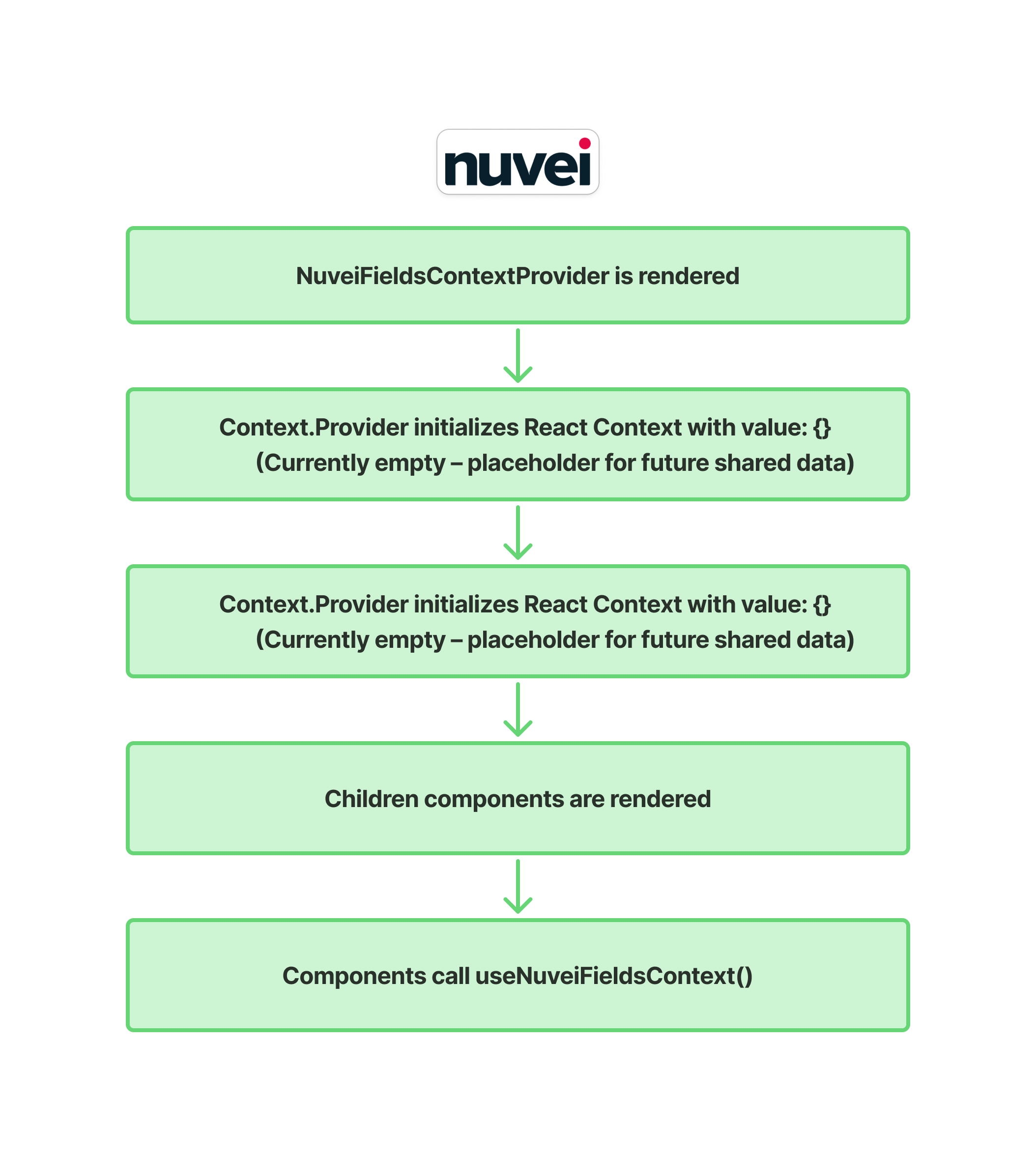
- Context Creation
export const NuveiFieldsContext = createContext<NuveiFieldsContextType | undefined>(undefined);
The context is typed as NuveiFieldsContextType | undefined. Consuming it outside a provider throws a descriptive error.
- Provider Component
export const NuveiFieldsProvider: React.FC<{ children: React.ReactNode }> = ({ children }) => {
  // ... all useState / useRef declarations ...
  return (
    <NuveiFieldsContext.Provider value={{ card, setCard, errors, setErrors, ... }}>
      {children}
    </NuveiFieldsContext.Provider>
  );
};
The provider owns all state and callback refs listed above, initialises them, and passes them as the context value.
All components inside <NuveiFieldsProvider> can access and mutate this shared state.
- useNuveiFieldsContext Hook
export const useNuveiFieldsContext = () => {
  const context = useContext(NuveiFieldsContext);
  if (!context) throw new Error('useNuveiFieldsContext must be used within a NuveiFieldsProvider');
  return context;
};
Throws if called outside a provider, preventing silent misuse.
- Co-located utility hooks
Two additional hooks are exported from the same file and rely on useNuveiFieldsContext:
useValidateFields()— returns avalidateFields(silent?)function that validates all four card fields, updates theerrorsstate, populateserrorsArr, and optionally callsonInputValidated.useTokenize()— returns atokenize()function that first runs validation viavalidateFieldsRefand, if there are no errors, callstokenizePost(sessionToken, card).
Card Validation and Blocking (blockCards)
NuveiFields supports restricting or blocking specific credit/debit card types, brands, or issuing countries using the blockCards rules array configured in NuveiProvider.
How it works
When the user enters a card number in the credit card input form:
-
Rule Evaluation Trigger
- As the user types in the card number field, a check calls the
getCardDetails()API. - The hook sets
loadingCardDetailstotruewhile the validation request is in flight.
- As the user types in the card number field, a check calls the
-
Fetching Card Details
- The SDK calls the
getCardDetails()API to fetch card properties such as card brand, card type (Credit or Debit), prepaid status, issuer country, and issuer bank.
- The SDK calls the
-
Rule Matching & Abort
- The returned card properties are evaluated against the
blockCardsarray. - If any rule matches (indicating the card is blocked):
- The custom card error
customNuveiFieldsCardNumberErroris set with a message (either fromlabels.errorMessageCustomisationor dynamically generated from the matched rule). - The validation error message is shown directly under the card number field.
- If the user attempts to complete the payment flow via
initPayment()while a block is active, the flow is aborted early and rejects the promise with error code10010.
- The custom card error
- If no rules match:
- The custom error is cleared, allowing the payment to proceed.
- The returned card properties are evaluated against the